LGBTQ+ Flags You Should Know About For Pride Month
Pride Month is held every June to celebrate the expansive LGBTQ+ community and honor the 1969 Stonewall Uprising in New York City (via USA Today). The annual LGBTQ+ Pride Month events attract millions of participants from all around the world. Everyone knows the rainbow flag is the LGBTQ+ Pride Flag, created by artist and gay rights activist Gilbert Baker in 1978 (via The Gilbert Baker Foundation). However, it's not the only flag with which people in the community now have to connect. Ever since the first Pride Flag's inception, many others have been created by different genders, groups, and identities worldwide. But, did you know there are over 20 flags that represent a wide variety of sexualities, identities, and communities and offer a larger sense of inclusivity (via Volvo News)? We've listed some of the most common LGBTQ+ flags, so read on to learn more about their origins and meanings.
Philadelphia People of Color-Inclusive Flag
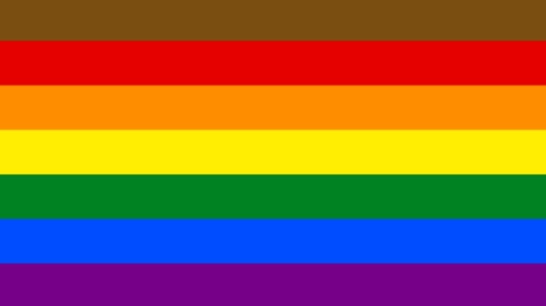
The LGBTQ+ rights and liberation movement has had a long history in the City of Brotherly Love, and in 2017, Philadelphia took a brave step toward ensuring LGBTQ+ representation. The creation of their flag stemmed from the years of prejudice that many were experiencing (especially people of color) within the LGBTQ+ community, and those affected knew it was a time for a change. Philadelphia's Office of LGBT Affairs teamed up with a design agency and created the Philly Pride Flag. The two stripes added on top of the rainbow flag represent the city's African-American and Latino communities within the city (via The Philadelphia Inquirer)
The flag was unveiled for the first time during Philadelphia's Pride celebrations in 2017. Even though initially the flag received criticism, it went viral and, over the years, has been seen on the silver screen and featured on Converse and Nike sneakers. Amber Hikes, the current Chief Equity and Inclusion Officer at the ACLU, told The Philadelphia Inquirer that Philly having its own Pride Flag "is a reality that I never even envisioned for this flag. It is humbling, a little bit surreal."
The Progress Pride Flag
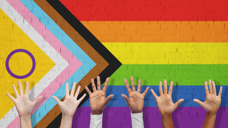
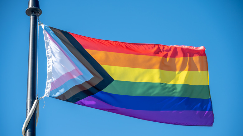
In 2018, Daniel Quasar, a non-binary artist and graphic designer, designed the Progress Pride flag, which has become the crest for the queer and transgender community of color. The black and brown stripes represent the LGBTQ+ communities of color that are often disregarded in addition to those living with HIV/AIDS or who passed away from the virus. The light blue, pink, and white stripes were used so that the trans flag would also be a part of the design. Quasar placed the black and brown stripes and the trans flag stripes to his flag's width so that they would form an arrow shape (via NEWNOWNEXT).
In an interview, Quasar shared why the flag is designed the way it is and revealed that the arrow points toward the rainbow flag to signify that while progress has been made in the LGBTQ+ community, much more advancement still exists and needs to happen. Quasar also shared that his redesign of the Pride Flag was essential because he "could bring something to the table when it came to the way the flag was shifting within the community" (via studenthighstreet.com).
The Transgender Flag
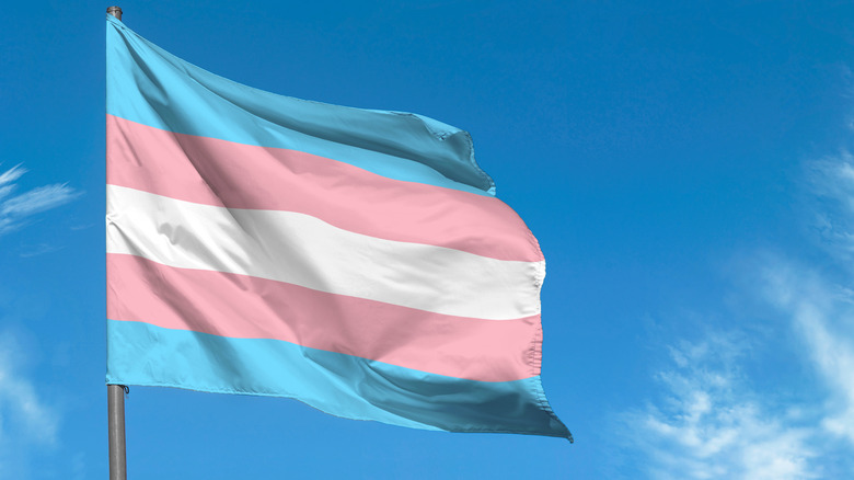
Monica Helms, a transgender activist and United States submarine veteran, designed the first transgender Pride Flag in 1999. She was inspired to create the flag for her community after chatting with Michael Page, the designer of the bisexual flag (via Military.com). While chatting with the Modern Military Association of America, Helms stated that Page told her to keep the design of her flag simply because it was cheaper to make and sell if she didn't have that much stitching to do. Helms recalled when she knew what the flag was going to look like. She noted, "Two weeks later, I woke up, and the design came to me while lying in bed. I got up and drew it out and liked what I saw.
In 2000, Helm's creation debuted at the Pride Parade in Phoenix, Arizona. The pink and blue stripes on the flag represent the colors customarily related to girls and boys. In addition, the white stripe between two pink stripes represents those who are transitioning, are intersex, and anyone that doesn't have a specified gender. According to Helms, "The pattern is such that no matter which way you fly it, it is always correct, signifying us finding correctness in our lives" (via Facebook). Also, during her MMAA interview, Helms shared she was shocked that the flag is seen worldwide and brings her joy, and hopes that one day will make it to the International Space Station.
Lesbian Pride Flag
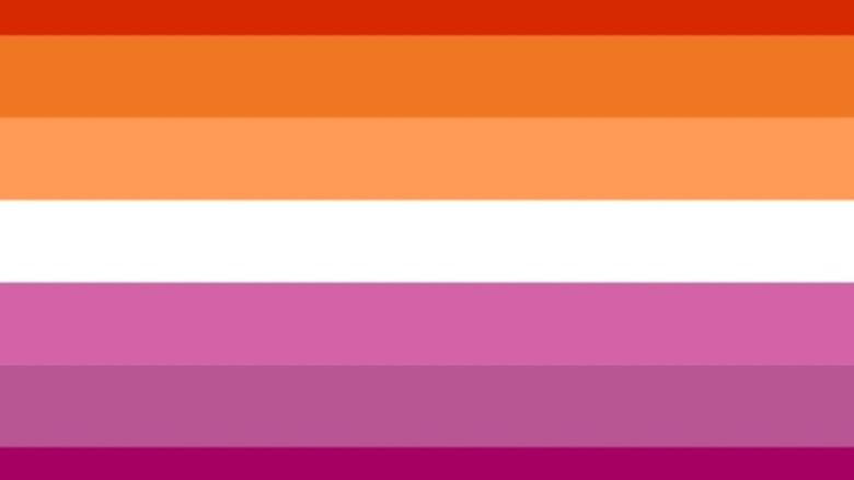
In 2010, a flag dubbed the Lipstick Lesbian Flag was created by Natalie McCray. The banner featured shades of pink, white and red. However, many in the lesbian community had problems with it because they felt it only represented lipstick or femme lesbians (via heckin unicorn). Co-chair of the Committee on LGBT History, Chelsea Del Rio, while speaking with Women's Health Magazine, stated, "The concern was that it only represents femme-presenting lesbians" and excluded androgynous butch and non-femme lesbians. While several lesbian flags exist, the Lesbian Pride Flag created by Tumblr blogger Emily Gwen in 2018 has become rather popular in the last few years.
The flag was designed to incorporate all lesbians, including trans lesbians, from across the range of identities. The flag's colors from top to bottom represent gender nonconformity, independence, community, unique relationships to womanhood, serenity, peace, love, sex, and femininity. In 2020, Gwen took to social media to thank supporters for embracing the updated creation and tweeted, "As of today, it's been 2 years since I first designed the orange and pink lesbian flag. Thank you so much for all the love I've been shown since then. The lesbian communities I'm a part of mean so much to me."
Intersex Pride Flag
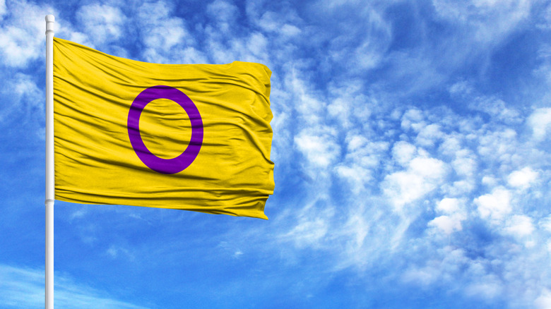
After worrying about the unfitting visual images and symbols used to describe the intersex community, an Australian named Morgan Carpenter created the intersex flag. In an explanation of the flag, Carpenter wrote, "The colors and circle don't just avoid referencing gender stereotypes, like the colors pink and blue, they seek to completely avoid the use of symbols that have anything to do with gender at all. Instead, the circle is unbroken and unornamented, symbolizing wholeness and completeness and our potentialities. We are still fighting for bodily autonomy and genital integrity, and this symbolizes the right to be who and how we want to be." While this isn't the first intersex flag, this is the most commonly used. However, according to Queer in the World, not every person in the community has supported the flag, and over the years, there have been many design changes to the intersex flag.
Pansexual Pride Flag
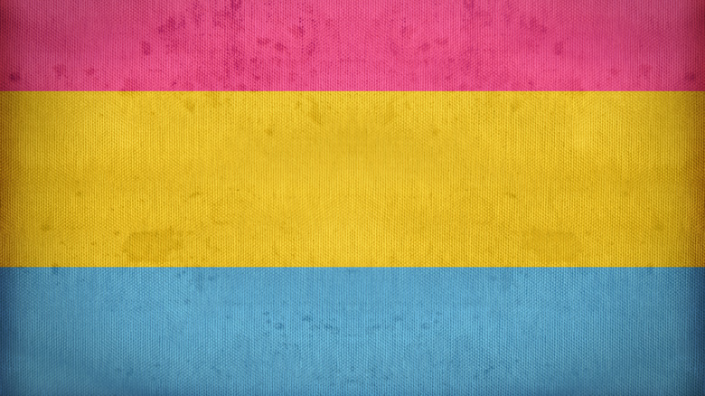
In 2010, a person by the name of Jasper designed the Pansexual Pride flag. The pink stripe symbolizes those who consider themselves feminine, the blue represents those who see themselves as masculine, and the yellow embodies all those who lie between those classifications. While chatting with Majestic Mess Designs, Jasper, who uses they/them pronouns, talked about what led to the flag's creation. They said they didn't feel like they identified with the term "bisexual." In 2010, when the word pansexual started to gain traction within the online LGBTQ+ communities, they found this more fitting. That's when they decided to design a flag. When asked how they felt knowing that the flag had become pretty visible worldwide, they stated, "Feels incredible. The first Pride I went to a few years ago where there were pansexual flags on display made me very emotional." At the end of the interview, they also advised the next generation who are thinking about creating their own flag and said they should be ready for good, bad, and lukewarm reactions. Jasper added, "If your hope is to have other people adopt it, it has to be something you don't want to change a year down the line."
Bisexual Flag
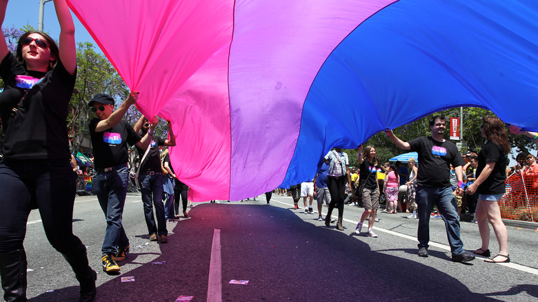
The Bisexual Pride Flag has been flying proudly for almost 24 years. It was conceived by bisexual activist Michael Page and revealed on December 8, 1998. Page took notice of the fact that the majority of bisexual people were feeling less of a connection with the rainbow Pride Flag and wanted to create one that all bisexual people could get behind so they could "maximize bisexual pride and visibility." According to Page, the reasoning behind the flag's colors is symbolism. "The purple pixels of color blend unnoticeably into both the pink and blue just as in the real world, where bi people blend unnoticeably into both the gay/lesbian and straight communities," wrote Page. (via wright.edu)
Wendy Curry, a former President of BiNet USA, a non-profit organization that promotes bisexual sexual visibility, recently spoke with Time about the Bisexual Flag. Curry stated that before Page's creation, the community needed a flag they could identify with when attending Pride Parades, so they wouldn't seem invisible. Curry also shared that the flag and its colors mirrored all the facets of her sexuality. Curry noted, "I think the idea that there's more than one color to our sexuality is reflected in the flag, and I love that."
Genderqueer Flag
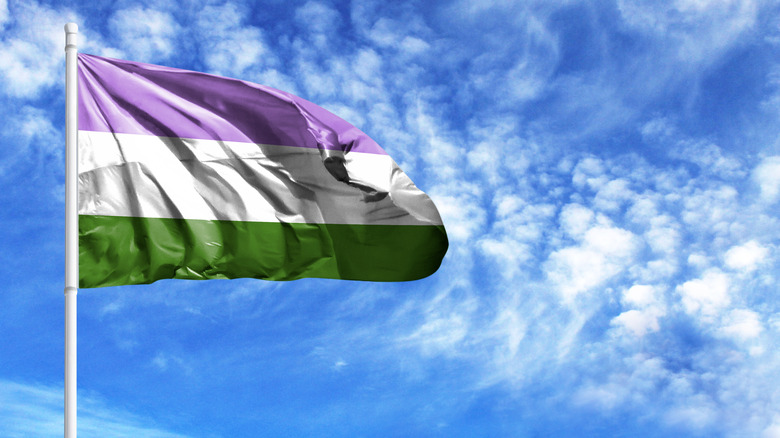
In the summer of 2011, synth musician Marilyn Roxie created the genderqueer flag. During an interview with The Buzz, Roxie explained color choices and what they represented. Roxie stated, "Lavender is a color that has long been seen as queer. It also happens to be a mix of pink and blue, stereotypical girls' and boys' colors, so I've used it here to represent a blending of boyishness and girlishness as well. White is in the middle and represents a gender (without gender) or neutral gender identity. Green, the inverse of Lavender, the representation of identities beyond and without reference to the binary two. It is not to say that androgynes are the 'opposite' of any other genders any more than women are the opposite of men in some way — just showing different shades of identity in a combination I found harmonious." Roxie also shared that the flag came about from struggling with identity and finding out there wasn't a flag for genderqueer and non-binary communities at the time.
Non-binary Pride Flag
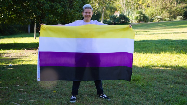
Kyle Rowan created the Non-Binary Flag in 2014 while just 17 years old. According to Cade Hildreth, the flag's creation was directly "in response to non-binary people feeling improperly represented by the genderqueer flag." The flag wasn't made to cancel out Marilyn Roxie's flag by any means but to be used in conjunction with the genderqueer flag. The yellow on the flag is a representation of those whose gender dost not exist within the realm of the binary. White stands for people that feel they identify with all genders or many of them. Purple signifies those with genders that are a combination of male and female, and the black stripe represents anyone that identifies with not having a gender at all. Rowan's creation has been embraced by the non-binary community and has been seen in the hand of Pride Parade attendees all around the world ever since.
Agender Pride Flag
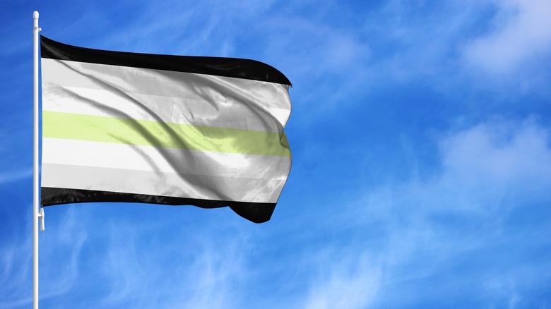
Staten Island native Salem X created the Agender Pride Flag in 2014. According to Rocky Mountain Flag, the black and white stripes on the flag symbolize an absence of gender, the gray represents semi-genderlessness, and the central green stripe represents those that have nonbinary genders. During a 2018 interview with Majestic Mess Designs, Salem X explained how the flag came about and shared that it was time for the genderless to have something of their own that wouldn't be a fad. She added that she "figured if there was a time to come up with a flag for genderless people, this was it!" Salem also noted that she was happy that the asexual flag ended up sticking in the community.
Elsewhere during the interview, Salem X also went in-depth about why she chose the colors for the flag and said, "The monochrome on the flag represents a spectrum of internal identities, from people who experience a strong feeling of gender, to those who experience no gender whatsoever." She then went on to say that the green stripe signified where agender would fall on the spectrum when it comes to the color blue, which represents male identities, and pink, which symbolizes females.
Aromantic Pride Flag
According to Aromanticism.org, aromanticism is "a romantic orientation" that "describes people whose experience of romance is disconnected from normative societal expectations, commonly due to experiencing little to no romantic attraction." In November 2014, an Australian named Cameron created the Aromantic Pride Flag. Cameron's flag wasn't the first aromantic flag that had been designed but is the third. Although we don't know what led to Cameron creating the flag, we do know that their version has become both the most commonly used and accepted within the aromantic community (via Queer in the World). The green and light stripes at the top of the flag represent the aromantic spectrum. The white stripe signifies the importance of platonic relationships and non-romantic love. The black and gray stripes embody the sexuality spectrum, recognizing the diversity of the aromantic community (via tumblr).
Every year after Valentine's Day, the community celebrates Aromantic Spectrum Awareness Week. The week is centered around spreading information and awareness about aromanticism and ensuring that voices and issues within the aromantic spectrum are heard and understood.
QPOC Pride Flag
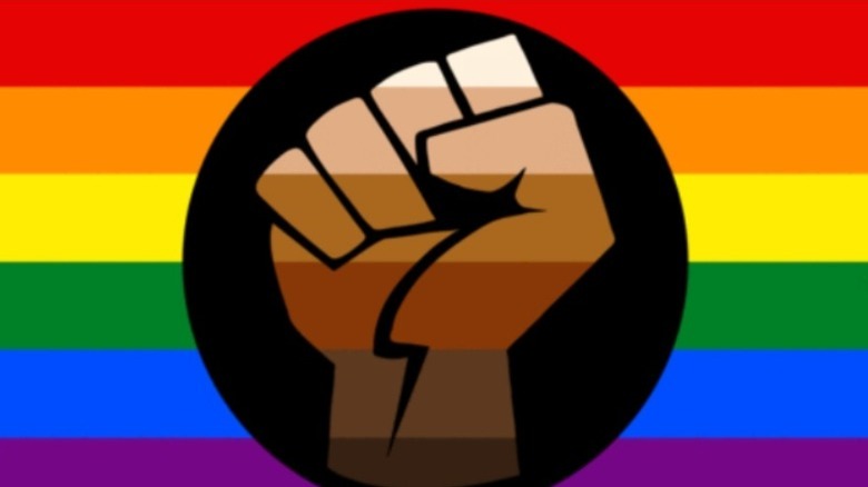
Unfortunately, little is known about the person or group that created the Queer People of Color flag. However, according to tripridetn.org, the flag began to circulate and gain recognition in 2020 at the height of the Black Lives Matter movement. The flag symbolizes an intersection of all people of color in trans and queer communities that have faced and are still facing harassment and racism due to their sexuality. On the flag, the fist represents unity and support for all people in the LGBTQ+ communities, as well as defiance and resistance to being mistreated. Additionally, the fist has been designed in various skin tones because it embodies the marginalized racial groups with these different complexions. The QPOC flag may not be as popular as other flags, but we're sure that as time goes on, more and more people will be flying it around at Pride Parades and events worldwide.
