A Look At The Inspiration Behind Euphoria's Visuals
Aside from the compelling narrative, incredible acting, and heart wrenching story lines, HBO's "Euphoria" has received accolades for its impressive and unique visuals.
Plot wise, the show takes a voyeuristic, borderline intrusive look into the lives of troubled teenagers, serving as a sort of drugged up, sex-addicted coming-of-age story for this group of teens who are desperate for self-discovery (via Vulture). While the show has been massively successful, it's notoriously a difficult viewing experience in terms of the dark subject matter, emotionally intense moments, and occasionally disturbing imagery.
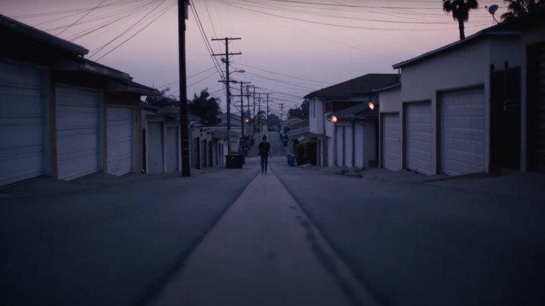
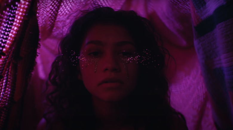
The show as a whole makes viewers constantly question what is real and what is fake – and a huge reason for this uneasy sense of doubt is delivered through the thoughtful and compelling visuals. The show presents an interesting juxtaposition of imagery with the production design having an incredibly dark and somber aesthetic one moment, followed by warping viewers into a glittery light show the next.
The director wanted to create a emotional reality through dramatic visuals
Director Sam Levison's relatively modest filmography might come as a surprise due to the show's massive success due to his smaller portfolio and inexperience within the industry.
According to Levison via an interview with Vulture, his goal for every scene was to create "an interpretation of reality or a representation of an emotional reality." He and his team sought to create a "non-realistic effect" through the manipulation of "wardrobe, makeup, lighting, set design." Through painstakingly planning each of these elements, Levison believes it had the exact effect he wanted it to – and it drives home the extent of the fantasy.
"Teenagers don't do extravagant makeup like this, and so on," he explained. "But at the same time, there's people constantly saying how real the show feels, which creates an interesting paradox." While the show deals with very real struggles and experiences that most audiences can relate to, it portrays them (and subsequently exaggerates them) through various visual qualities that make the issues at hand poignant and clear.
And indeed, an effective piece of visual art would be nothing without a cinematographer, which is where Marcell Rév comes in.
The imagery sought to evoke a sense of energy and elevation
Just as up-and-coming within the industry as Sam Levison may be, Marcell Rév's portfolio takes a more quality over quantity approach. While he doesn't have many projects in his back pocket, what he has worked on and shared with the world is simply stunning to view and demonstrates his incredibly impressive eye.
As for his work on "Euphoria," he and Levison appear to have always been on the same page as far as what they wanted the show to look like. Deadline asked Rév all about the "sophisticated camera movement, highly cinematic lighting, and a saturated color palette" that make "Euphoria"'s visuals so unique and effective, to which he replied that heband Levison wanted to make the show look "the way teenagers imagine their lives to be." Rév would manipulate the lighting and camera movements in a way to make everything appear "elevated" and to give the screen a sense of "energy."
As for the color palette, the goal was to use color in a way that really drive home an emotionally elevated aesthetic. Rév told the outlet, "It has to be colorful in a way, I think, to feel that elevation. But we didn't want it to go like rainbow colors, or with no real system in it," he explained. "So, most of the time, we're using primary colors, and I'm relying a lot on the orange-blue color contrast, which is a really basic one."
Indeed, the work done by this incredibly impressive team has led to a visually compelling masterpiece with some overall pretty great vibes.
This is the intention behind the color palette
As for the color palette, the goal was to use color in a way that really drove home this emotionally unreal vibe. Marcell Rév told Deadline, "It has to be colorful in a way, I think, to feel that elevation. But we didn't want it to go like rainbow colors, or with no real system in it," he explained. "So, most of the time, we're using primary colors, and I'm relying a lot on the orange-blue color contrast, which is a really basic one."
The aforementioned team created nothing short of a masterpiece with "Euphoria." Its subsequent content created an emotionally wrenched audience begging for more of this gorgeously voyeuristic light show, eliciting something of a Stockholm Syndrome-like response.
"Euphoria" catapults the viewer into a juxtaposed state of melancholy and amazement with stunning visuals that won't be forgotten anytime soon, and a team that will no doubt continue to produce content of the same caliber for years to come.


