Leanne From Restored By The Fords Swears By This Paint Color
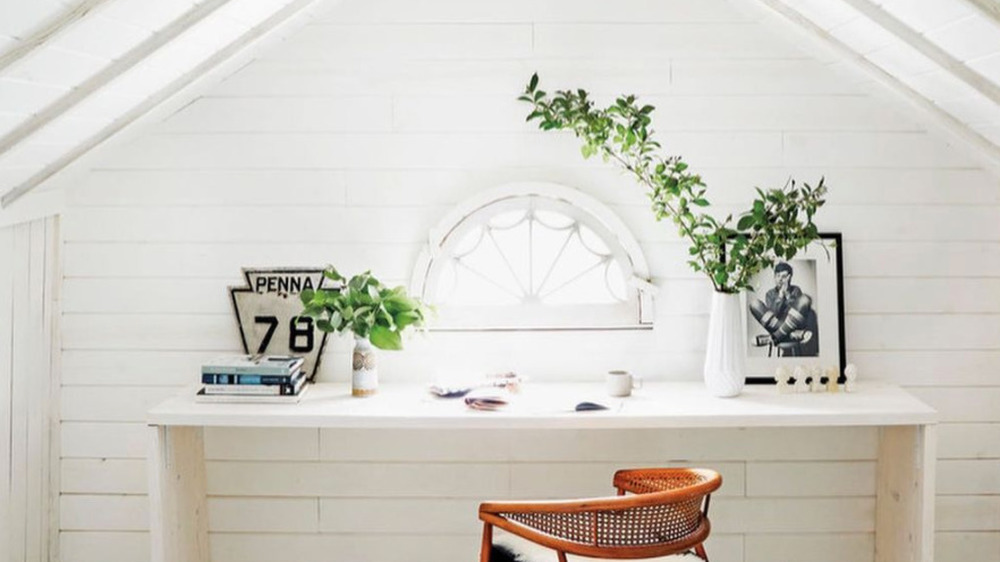
If you've watched any of Leanne Ford's design transformations on HGTV's Restored by the Fords or Home Again with the Fords, you could probably recognize her style out in the wild. It's airy, whimsical, and bright with touches of vintage and modern influence. As evidenced by her full-on mood wall, she draws inspiration from most things around her including, but not limited to magazine clippings, postcards, photos, trinkets, and more. And although she takes pride in all parts of the design process, from choosing light fixtures to trim to art — there's one step that she will always hold dear, and that's painting — not just walls, but anything she feels needs a fresh coat or new life.
In particular, Ford has a deep love for white paint, which may seem plain or boring, but to her, it's the opposite. "I always say it, but I believe it fully... #WhitePaint is the #blankcanvas for everything else to be noticed," she wrote on Instagram. "#texture, #art, #nature." And over the years, she's found a few shades of the snowy color that she stands by.
Leanne Ford's white paint color guide
If you thought white paint was always just one shade of white, get ready to have your mind blown. On her blog, Leanne Ford breaks down her favorite shades that she launched in a collaboration with PPG, and how she likes to use them.
First, there's the true white Timeless paint, which doesn't even have to be mixed. "You can get this one right off the shelf and paint away," Ford wrote. "My friends will write me constantly to ask which paint to use, and that's my forever suggestion. It's the perfect white, no tint, and it works well in high gloss and/or flat. I love it. And you don't have to think about it or mix it; it's sitting there waiting for you. I've done two of my houses top to bottom in this white."
Then there's Natural White. "It's a warmer, natural-feeling white. It has a kind of ceramic feel to the color. I love how the wood looks soaking through this shade," Ford explained. And lastly, we have White on White, the coolest tone of the three. "We used this in a farmhouse project in Pittsburgh, and the white was perfect for the space. It felt fresh and clean but slightly more vintage," she shared. "It worked incredibly well with the woods and bricks that we had throughout the house too."

