The White House Finally Made This Important Change To Its Contact Page
With Joe Biden now installed as the 46th president of the United States and new resident, along with Dr. Jill Biden, of 1600 Pennsylvania Ave., it's clear that change is on its way — immediate change. In fact, President Biden's first orders of business included more than a dozen executive actions, including changes to U.S. policy on the environment and immigration (via CBS News).
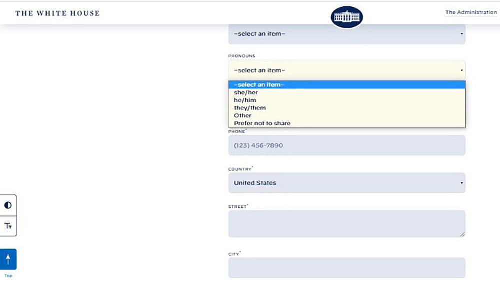
Visitors to the White House website will also encounter changes, including one important one that is a long time in coming: pronouns. The contact form at whitehouse.gov now includes an optional drop-down where visitors can select a pronoun from three options, or "other," or "prefer not to share." If people do choose to share, they can select now from "she/her," "he/him," or "they/them."
After winning the election in November 2020, the Biden-Harris ticket promised that their team was going to be one that "looks like America" (via Politico). This commitment to diversity and inclusivity had already been evident in how Biden's Cabinet has been filling out, and this change to the White House's contact form is one more important step, in step with that promise.
Other changes to whitehouse.gov include a choice to navigate in Español
In addition to the inclusion of pronouns to the White House's contact page, the website also now prominently features on the menu (and in light blue) the option to navigate the site in Español. If selected, the website refreshes and everything is in Spanish.
During her inaugural performance of "This Land Is Your Land" and "America the Beautiful," singer Jennifer Lopez recited part of the Pledge of Allegiance in Spanish. This part: "One nation, under God, indivisible, with liberty and justice for all." Unity was the theme of the day, with President Biden saying the word eight times in his inaugural address, including "Of unity, not division" and "This is our historic moment of crisis and challenge, and unity is the path forward" (via Politico).
Furthermore, as The New York Times points out, whitehouse.gov also now includes accessibility components, such as options for a larger font size or a higher contrast. These two buttons on the left side of the site are static as well, so there's no chance of scrolling past them. The overhaul to the website is in a word impressive, in how smoothly and quickly the changes have been implemented. This is day one. All promising signs for this new administration, one clearly ready to get to work.

