Etsy's Choice For Color Of The Year Sounds Like A Winner
Every year, major color influencers pick a "color of the year" that they feel best reflects the zeitgeist of the world — our attitudes, ideals and hopes. The yearly shades are also chosen based on growing consumer trends, which is why you saw a lot of playful turquoise accessories in 2010 and richer emerald-hued clothes and household goods in 2013 (via Sviiter). In some ways, it's a shame that the color choice isn't retroactive; if ever there was a year that called for poop brown, 2020 was it. But if the colors for this year are any indication, we should be seeing brighter days ahead, and not a moment too soon.
A number of color and trend authorities select their own choices for Color of the Year, so it's common to see more than one shade making the news and influencing what we see in our favorite stores (via Better Homes & Gardens). Design firm Pantone Color Institute is one of the major players, and for 2021, they actually opted for two colors: lemony-yellow "Illuminating" and steely "Ultimate Gray." The institute explained that the combination represents "a message of positivity supported by fortitude ... that gives us resilience and hope."
In the same vein, Etsy has now announced its own Color of the Year for 2021, and its choice is similarly optimistic. You could even say that they're "looking up."
Etsy's Color of the Year is serene and hopeful
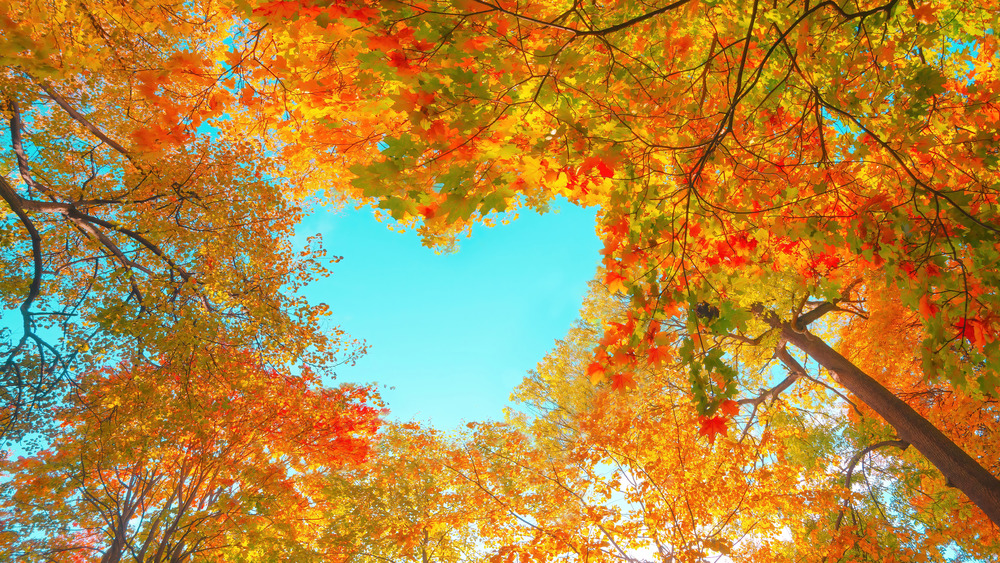
In its website's Year in Review blog, Etsy recently announced that its Color of the Year is sky blue. Trend expert Dayna Isom Johnson noted that "shoppers are looking forward to bluer skies ahead. While there are still many hurdles to overcome, hope is on the horizon and there is a renewed sense of gratitude and connection to our communities." She also notes that 2020 saw an uptick in outdoor living and events as a response to the pandemic, so anything reminiscent of nature is still expected to be super-trendy this year
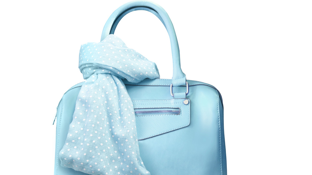
Already, the company has seen a nearly 40 percent increase in searches for light- or sky-blue items — and why not? It's a classic shade that works either as a complement to darker tones, or as a pop of color in a neutral setting. The Zoe Report offers some suggestions for incorporating it indoors and out: in a mixed-tone wallpaper, an eye-catching piece of furniture, an outdoor tableware setting, or even as part of a multi-hued blue room. When it comes to this year's color, the sky (blue)'s the limit!

